How To Design Responsive Websites In 2023?

Initially, it was impossible for cell phones to read a given webpage on mobile devices when they began to access the web. Responsive web design services made it possible.
Web design that is responsive adapts the layout and functionality of websites to fit the device of the viewer. This ensures that content is displayed in a way that is aesthetic and legible on any screen, no matter what size or proportion it is being viewed on.
Designing a Responsive Website: the Essential Elements
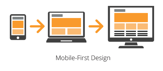
In order to create a successful responsive website, a few key elements must be addressed. To start, you need to recognize that there are a variety of devices and users, as well as a variety of needs and habits. Depending on these circumstances, your content and structure can be adapted accordingly.
Diverse Device Design
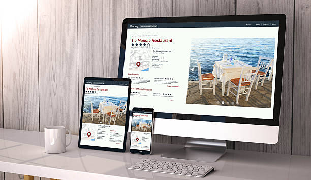
It is important that your site is capable of adjusting to a wide range of screen sizes, including desktops, laptops, tablets, and mobile devices. There is a wider range of device sizes and proportions now, so it can be better to think of this as a continuum rather than a separate category. Additionally, users can view in landscape or portrait on mobile devices, so you'll need to adjust your design accordingly.
Consider what future devices might look like in terms of sizes and proportions. Building flexibility and fluidity into your site at the outset will keep it from having to be updated every time there is a technological update. It is ultimately the device that determines the flow of content, not vice versa. Hire good responsive website design services.
Relative Length Units
You can make your site responsive by setting the size correctly. When designing responsively, use viewport- or font-related units such as vh or VW and em or rem. Responsive logo design services will allow you to scale your site no matter how the size of the device or the font changes.
Layout
Maintaining the look and legibility of your site across devices relies heavily on the layout of your site. Your layout should become more vertical as the viewport narrows by taking into account columns, grids, and negative space. Layouts can be changed while maintaining a logical structure by incorporating flexible grids. It is possible to control and facilitate those changes by setting minimum width, maximum width, minimum height, and maximum height properties.
Multi-column layouts can look good on laptops, but on mobile screens, they can cause your content to look crowded and require you to use text that is too small to read. This is when fluid grids are especially helpful. Columns can reduce as you move from larger breakpoints to smaller ones.
The Navigation
On different devices, navigation will not only look different, but users will interact with it in a completely different way. An easy-to-use navigation bar along the top or side of a monitor is natural when using a laptop with a trackpad. The same may be true for tablets.

Nevertheless, users will expect one-handed functionality as soon as the device gets small enough to be held in one hand. When you reach a mobile breakpoint, you can enable thumb navigation by placing the navbar at the bottom of the screen. A size of 48dp is recommended for thumb navigation.
A navbar with navigation options along its entirety is more discoverable on larger screens. The button size can also be increased to make it easier to use with fingers as the screen gets smaller and visible real estate becomes more valuable.
Images
In order to prevent slow loading times with overly large files, use responsive images that scale with your site's resolution.
Your layout should also include images that scale with the layout. A Responsive logo design services provider will help with this. Is your imagery informative or decorative in relation to the rest of your content?
Do you need to scale your images differently because of that function? If half of the infographic is cut off or too small to read, it won't be as helpful as a background image overflowing the screen.
Text
Despite the strange appearance of an oddly laid-out image, bad text formatting will completely break your responsive web design. Don't make your text too small to strain readers' eyes and not too large to fit only a few words at a time. Always use em or rem units and make sure your text is sized to be effortlessly readable.
You should ensure that the text does not get cut off or overflow the viewport when you move through breakpoints. Ensure that headlines, body paragraphs, and functional text, such as within buttons, maintain a suitable aesthetic balance as they scale.
Accessibility
Responsive web design makes the internet more accessible to a wider audience. Designed correctly, a responsive site can respond to the needs of users, not just their devices. Those with disabilities, low or no vision, language difficulties, or motor-function limitations may have difficulty navigating websites. You can still make sure that they can successfully use your website.
When designing it with responsive web design services, keep screen readers and other assistive devices in mind. Some screen readers can have difficulty navigating non-fluid elements, such as fixed tables.
It will also help if all text is broken up into paragraphs or has alt text, as they cannot read text within images. When you add alt text to your images, people with limited vision can understand your site's visual elements, plus search engines can find them for search engine optimization.

Comments
Post a Comment